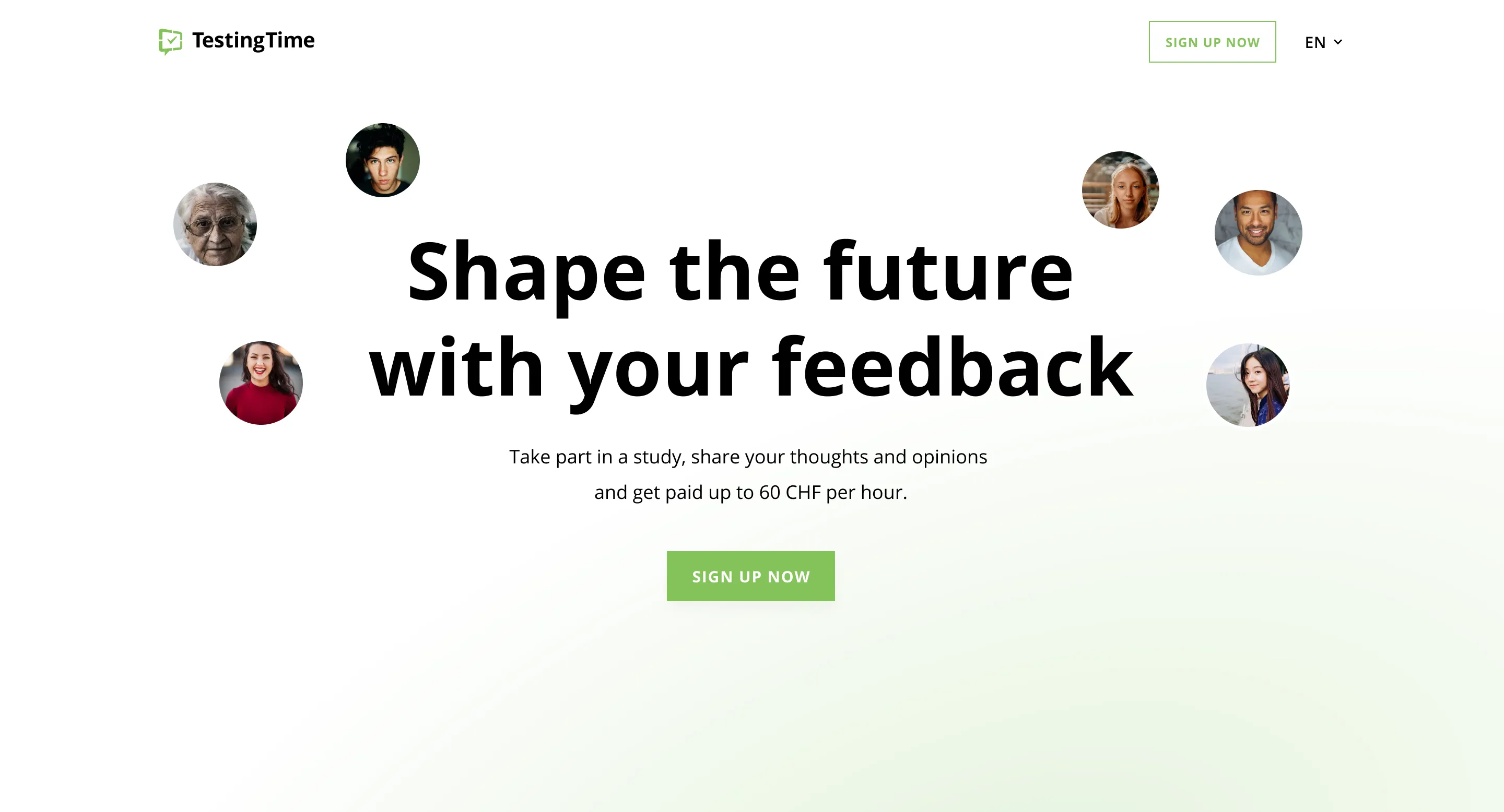
TestingTime
It's time to test
Testing products before launch is a necessity rather than a luxury, as it increases the chances of success many times over. However, because product testing is time-consuming and only meaningful when conducted with the right target groups, companies rely on TestingTime's services.
To make TestingTime's website more attractive to companies while simplifying and speeding up the registration process for test users, we turned the homepage upside down.
+
1
0
5
unique page views
+
4
7
test user registrations


CHALLENGE
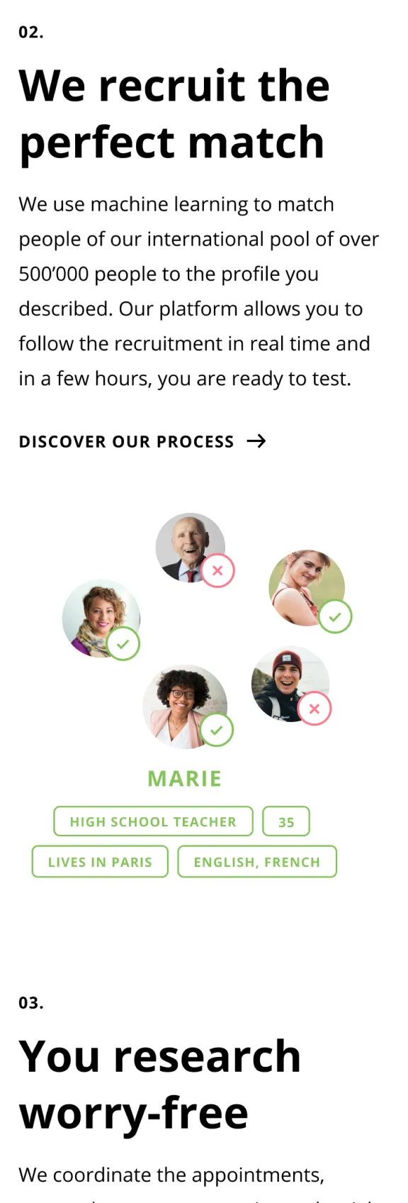
Two different user groups
TestingTime's offering is aimed at two different target groups with different goals:
- companies who want to test their products
- test users who want to participate in product testing
The clear dividing line between the two groups was barely visible or noticeable on the homepage, leading to confusion and disorientation on both sides: companies got lost in the information for test users and vice versa.
“It was all about creating a great user experience — but looking back, it was also a pretty smart business move.”
Solution
User-tailored stories
Killing two birds with one stone is difficult. Most of the time it doesn't work out. We therefore proposed and implemented a new strategy: one bird, one stone.
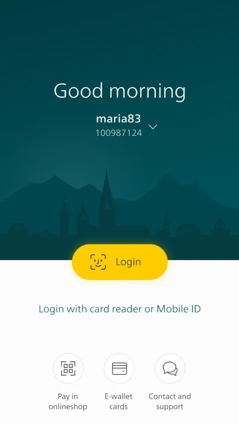
The homepage is now targeting companies as the primary user group. Through a narrative structure of the page, companies dive "chapter by chapter" into the processes of a product test and learn more about their benefits along the way. For test users as a secondary user group, we created a separate landing page. The landing page is based on the same storytelling approach, only with content tailored to their specific needs and goals. With the prominent call-to-action button "Become a tester" at the top of the homepage, we ensure that no test user ever misses the "take-off" to the landing page.
A home(page) for companies
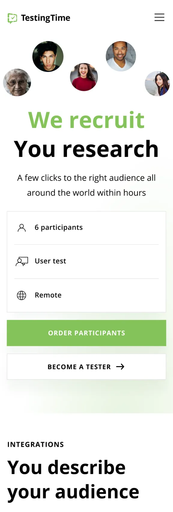
By moving the CTA for test users from the bottom to the top, we literally turned the homepage upside down. This way we (1) ensure that no test user ever misses the entry point, and (2) we could tailor the homepage exclusively to the needs of companies. For example, we transformed the header into an easy-to-use price calculator. And when scrolling down the page, you no longer browse a hodgepodge of information, but you dive step-by-step into the key stages of a product test, incl. all its benefits for companies.


A landing page for test users
Landing on the page for test users, it's not a price calculator that's flashing at you in the header, but the "Sign up now" button. And when scrolling down, same as for companies on the homepage, you discover step-by-step the key stages of a product test. Only this time highlighting the benefits for you as a test user.


It's testing time
From the initial drafts to the final prototype, we worked closely with TestingTime to tailor the site's structure and content as closely as possible to the needs of their two target audiences. But also to develop a new visual design that represented their company brand attributes. When testing the pages with representatives of both target groups, we therefore asked not only about the usability, clarity and comprehensibility of the content, but also how they perceived the new design based on semantic differences.
“A good landing page is both: user-centered and visually appealing.”


Conclusion
Clear user focus pays off
It‘s almost like 2-in-1 products, if you try to address two needs at a time you often fail to fully satisfy either of them. The same applies when (re)designing a website: if you set a clear user focus, the page will perform better.
With the new homepage for TestingTime, we address the primary target group with even more specific and personalized content, while providing easy access to the landing page for the secondary target group. By clearly separating the two different target groups, we were able to tailor the content more closely to the individual needs of the users, which measurably improves usability for both groups many times over.
Project facts
Market
B2B
Industry
Technology
Type
Website
Services
Design
Duration
3 Sprints
Go Live
December 2020
Project team

Romain
UX Design

Daniel
Client Partner

Katharina
Product Partner

Céline
UX Research