Thermoplan
Ordering coffee without falling asleep
User interfaces that we use several times a day have to be perfect. User interfaces that we use only once a month have to be even better. For example, the coffee machine at the gas station. If it takes you a minute to get to your coffee, the person waiting in line behind you will leave the store. Even if the coffee is as excellent as the one from Thermoplan.
Thermoplan makes high-end coffee machines for self-service. The coffee comes from their own bean roaster. The machines are adjusted by professional coffee sommeliers. Yet, only the interface was not top-notch. In order to change that, Thermoplan teamed up with Ginetta.
+
2
2
increase in usability score
-
5
2
fewer taps for coffee
+
4
5
more orders per hour possible

Challenge
A long way to your coffee
Since the company was founded in 1974, this was the first time Thermoplan brought in a UX expert. Considering that, the interface was quite good. But through the lens of an expert we could still find a lot of potential. At first glance, the interface seemed to offer everything a coffee connoisseur could wish for. However, the user flow was cumbersome. The customer has to answer each possible coffee option on its own. The potential of the screen was not optimally used. The design was a bit inconsistent. There was an overload of information on the screens. Customers had to reorient themselves on each additional screen. It took them over a minute to finally select the desired coffee.
"As soon as I added the flavour, I didn't know how to proceed. That was a bit frustrating."
Solution
An interface on coffeine
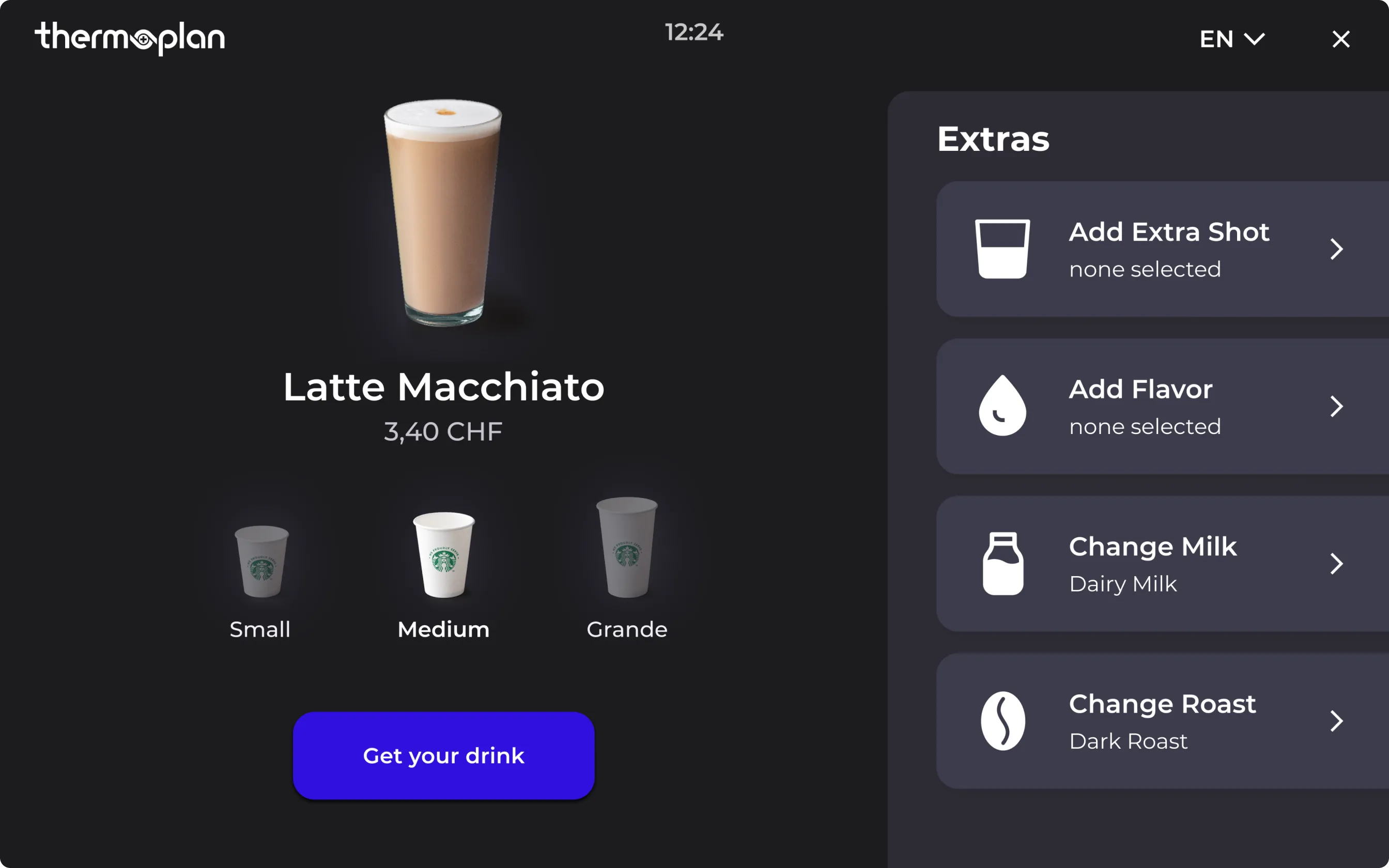
The overall goal of the project was obvious: to shorten the path to that fine coffee. The interface should become more intuitive so that the proverbial loading bar disappears in the minds of customers. To do this, we need to make the best use of every screen. However, there was no research on the existing interface yet. We installed a coffee machine in our office and we constantly updated the interface with the latest design in order to continuously gain new data. (The Thermoplan coffee is really delicious!)
As clear as hot water
We created a clear visual hierarchy that allows users to follow the journey smoothly. The action button to finalize the process is associated with the main product and stays visible all the time. The most important task is kept in focus and is surrounded by subtasks that are optional. So clients can order their coffee without having to bother with options they may not want anyway. The price is always shown and simultaneously adapts when changing options.

Understanding without thinking
Ordering a coffee should be an easy task – even at a machine that you use for the very first time. We designed the user journey as intuitive as possible. Similar tasks are grouped together for a more practical overview. The customers understand which task is essential and which ones are secondary. And they are always aware where they are within the process. Self-explanatory icons and design elements help understand each screen at first glance. A consistent screen design speeds up the decision process.


6 seconds to heaven
The Thermoplan coffee machines are able to collect data. Why not use that data for practical purposes in a user-friendly way? We used a part of the screen saver as a quick option: the most ordered coffee of the season. This coffee can be ordered with a single touch. In this case, the ordering time for the coffee takes only six seconds.

"If I am in a hurry I can just click through the menu and get a standard Latte Macchiato without dealing with all the extras."
Conclusion
More time for enjoyment
We have succeeded in reducing the ordering and waiting time for the Thermoplan from 60 seconds to as little as 6 seconds for the fastest option. Ordering the exact same delicious coffee as before now the user has to tap 50% less on the screen. On average, the selection process for all options has been shortened by 40%. This is a nice benefit for every single customer. But for the operators of the machines, it also means an increase in coffee customers.
Project Facts
Market
B2B2C
Industry
Food & Beverage
Type
POS Application
Services
Design · Research
Duration
4 Sprints
Go Live
2024
Project team
Jana
Strategy
Nadine
Client Partner

Kilian
UX Research

Philippe
Strategy

Yulia
Visual Design

Stephan
UX Design